Are You Following These 10 Contact Page Best Practices?
| September 13, 2017 | Posted in Content Creation
One of the most important pages on your website is your contact page. This can either be a space that provides the necessary information and encourages action – or a reason why you’re losing website traffic and potential customers. Contact form best practices are simple and easy to implement. So brush up on your ‘contact us’ verbiage and formatting and get the most out of your website!

Contact Page Essentials
No matter what type of business you run, your contact page should at the minimum include the following elements:
- Business name
- Physical address
- Phone number
- Contact form
If you have multiple addresses, include them all! If you don’t have a public office, list your P.O. Box! The most important component is to provide as much information as possible to show credibility and trustworthiness.
Contact Page Best Practices
1. Provide multiple contact options.
If your contact page only supplies a form, or only lists a phone number – what happens if the visitor can’t or won’t use that tool? Provide multiple options to cover every preference, whether that be email, phone, or form.
2. Don’t make your page name fancy.
We get it. You’re trying to be unique in a sea of websites. However, if you name your contact page anything other than the standard verbiage for contact, you’re going to confuse visitors. Confused visitors means less traffic and less conversions.
3. Update your information ASAP.

If any of your contact information changes, update your website immediately. You’d be surprised how many websites list phone numbers that aren’t in service or old addresses no longer in use.
4. Make the form fool-proof.
Some contact forms are too long, aren’t mobile responsive, or the plug-in is actually broken and you can’t use the form at all! The form should be simple, easy to fill out, and work every time.
Also, make sure the information you request is relevant to your customer base. Commenter Tricia on a Yoast article says, “Really hate it when the form includes required fields that are not relevant to me. For example, US States as drop-down list without an “other” option. I’m based in Australia.”
5. Provide confirmation that you received their form.
Imagine you click on the submit button and the page simply reloads back to the original contact page. You’d probably wonder if there was an error and you have to fill the form out again. Don’t keep your customers guessing – let them know on a separate page or a pop-up that you’ve received the form and provide a timeline for when they can expect to hear from you!
6. Invest in quality captchas.

Every website deals with its fair share of spam. Captchas are a fact of life on the internet. However, your captcha gateway shouldn’t be so difficult or low-quality that it’s impossible for a real person to get it right. Use high-quality captchas!
7. Optimize page placement within the navigation.
Ever heard of the Serial Position Effect? It’s a psychology term that refers to a person’s ability to remember the words at the beginning and end of a list better than ones in the middle. Use this knowledge and place your contact page appropriately! This is why many websites list their contact page at the far right of the main menu.
8. Provide extra information if it improves user experience.
The information you include on your contact page really depends on your type of business. It’s a good idea to include more than just the essentials listed above if it will improve a user’s experience. Here are a couple examples.
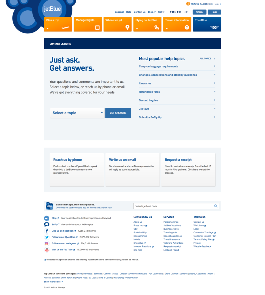
JetBlue
JetBlue knows that they’ve probably answered your question previously. So they created a help center located at the top of their contact page to help you before you even look for an email or phone number. With a large customer-service oriented company like this, an online help center can alleviate the number of phone calls, emails, and contact forms flooding their employees on a daily basis – plus it makes the customer feel empowered.

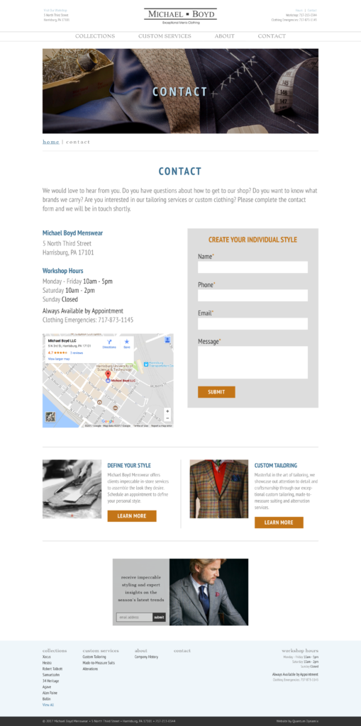
Michael Boyd Menswear
With a physical shop location, Michael Boyd understands it’s important to let potential customers know where the shop is located and what hours the door is open. There is even a built-in Google map that shows the physical address of the shop.

9. Provide clear calls-to-action.
Make sure your form and verbiage contains clear calls-to-action for every visitor. Identify what your main goal of the page is, and visually guide the user to where you want them to go. Keep too much extraneous information off of the contact page to encourage the traffic flow you want.
10. Answer your inquiries.
This seems like a no-brainer, but many websites still do not regularly check their inquiries! Nothing is more frustrating than trying to reach out to a business and being ghosted. Double check that you know where those contact forms are sent and who is in charge of answering them.
Final Thoughts
Your contact page should help customers reach out to you quickly and easily. Always visualize the page from a customer’s perspective. Stop making common mistakes by utilizing these contact form best practices today!

