The Importance of ADA Website Compliance [VisionCorps Case Study]
| July 26, 2017 | Posted in Marketing
When’s the last time you thought about how accessible your website is to users who are blind or visually-impaired? Even though ADA website compliance is the law, many businesses have failed to update their websites to accommodate these users. Most recently, Winn-Dixie is in the news for failing to provide ADA compliant web design. A user who is blind was unable to use their site, filed a lawsuit, and a Miami judge ruled that Winn-Dixie violated the Americans with Disabilities Act. If your website is not currently accessible to the visually-impaired, it’s time to think about updating your site for compliance and user experience.
Quantum Dynamix recently completed VisionCorps’ brand new website – built to set the standard for visually-impaired, ADA compliant web design and functionality. Discover what features we incorporated and how users who are blind are adjusting to the new website. This is a case study for ADA online compliance that you can utilize for your own website.
The History of ADA Website Compliance
When the Americans with Disabilities Act (ADA) was first passed in 1990, the internet had yet to take off. However, the ADA has realized the importance of including online spaces within its parameters. If your business is considered a ‘place of public accommodation,’ then your website must be ADA compliant. Multiple rulings from judges have set legal precedent that websites must be accessible and are at risk of heavy fines and penalties when they are found not compliant. Winn-Dixie is the latest business to learn this the hard way.
With an estimated 7 million adults in the United States having some sort of visual disability, it’s become more important than ever for businesses to understand how they can create a more accessible online environment.
Here are some examples of the common barriers a user with vision-impairment might face on a commercial website.
- Sites that don’t support assistive technology software
- Images that don’t provide a text counterpart
- Downloadable documents only provided in PDF format, which cannot be read by assistive technologies
- Colors and font sizes that are created with the assumption that everyone will be able to view them the same
- Multimedia that lacks accessible features like audio descriptions
The ADA now has an entire chapter in their toolkits dedicated to creating accessible websites. You can read their guidelines here.
*It’s important to note that while U.S. law is slowly changing for the better, there are still significant improvements to be made in the online world, one being photo representation.
VisionCorps’ ADA Compliant Website
VisionCorps’ mission is to empower individuals with vision loss to attain independence. They understood that accessibility to the programs and resources on their website was vital to the success of their mission. They partnered with our agency to design a website that would become the model for other businesses looking to create accessible web design for individuals who are blind or vision-impaired.
We not only referenced the ADA’s requirements while building the website, but also sat down one-on-one with users who are blind to see how they navigated the site. These individual sessions were invaluable and provided more insights than just the law’s basic requirements. Instead of making assumptions about how these users would interact with the site, we took the time to observe their real interactions and used that data to formulate new features.
One of the most frequent users of the new website is VisionCorps employee, Brian Braightmeyer. Legally blind, Braightmeyer says,
“With the new website, it enables me to be able to navigate through the website and obtain all the information that’s on the page that was normally not available on previous websites and on many of the commercial websites out there.”
Watch the recent News 11 feature on VisionCorps’ website.
Top Features of an ADA Compliant Website
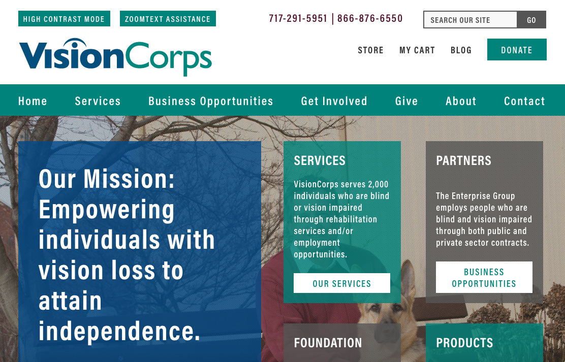
VisionCorps’ website is the industry leader for vision-impaired design. We utilized the following features and design elements to meet ADA compliance guidelines and ensure the best possible user experience.
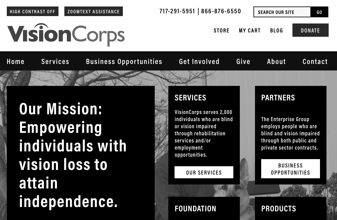
High contrast mode
With the click of a button, a user can choose to view the website entirely in black and white.


Zoom text support
The website can now support the Zoom text software found on many computers used by individuals with vision-impairment. This software allows users to magnify the text without losing the integrity of the page’s navigation.
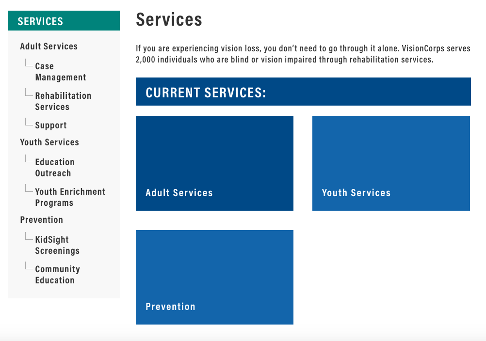
Permanently expanded left-hand navigation
Navigation was a major pain point on the previous site, so we made sure that access to the site’s pages was easily accessible at all times.

Full use of the Accessible Rich Internet Applications (ARIA) syntax
This syntax supports Job Access with Speech (JAWS) and other screen readers. Images also utilize alt text that describes the image for the screen reader to translate.
Improved contrast & font
Font is made larger and better contrast between colors means it’s easier to distinguish what’s occurring on the page.
Clearly defined text boxes
Important text is clearly laid out within boxes that make for easy reading.

List-view calendar featuring large print numbers
The calendar was designed to be easily read by those with varying degrees of vision loss, whether they are searching events on their own or utilizing a screen reader.
Website Analytic Comparison
We compared the Google website analytics from July of 2015 to July of 2017, after the launch of VisionCorps’ new website. Their redesign not only made the site ADA compliant, but also optimized the website for better search engine rankings and user experience. The redesign helped increase the number of visitors coming to the website on a monthly basis, the amount of time a visitor spends on the site, and the number of pages viewed in total. Here are the results.
- Pageviews increased 157.64%. Pageviews went from 1,034 per month in July of 2015 to 2,664 in July of 2017.
- The bounce rate decreased from 85.39% to 49.37%, meaning less visitors are choosing to leave the site right away.
- The average session duration increased 200.23%. The average session now lasts over two minutes, compared to just 40 seconds in 2015.
- During these longer sessions, visitors are viewing more pages per session. The average page number increased 154.39%, from 1.10 pages per session in 2015 to 2.80 pages per session in 2017.
- Returning visitors only made up .2% of total traffic in 2015, but now make up 23.1% of traffic in 2017. This means they found the website valuable and want to continue to use the site as a resource.
These impressive statistics show how invaluable a well-designed, modern website truly is. The new website draws in more visitors, encourages them to stay for longer periods of time, view more information, and inspires repeat visits. This steady traffic will help VisionCorps reach more people, and their ADA compliant design will help more people take advantage of their services.

