Improve Your Website’s Navigation with these 9 Best Practices [Infographic]
| September 6, 2017 | Posted in Content Creation
Website navigation is critical to the overall success of your sales and marketing goals. You could be losing out on 50% of potential sales if visitors to your website can’t find the information they need (Source). Here are our recommended website navigation best practices. These best practices will improve the user experience and as a result your traffic and conversions.

1. Use Standardized Menu Formats.
Your navigation bar is not the place to get creative. If being creative inhibits the user experience, then your website will not perform well. A visitor will expect navigation items to fall at certain places – Do not make it necessary to use the search bar function.
Two common navigation signifiers are the hamburger and magnifying glass. The hamburger is the universal indicator for menu, and the magnifying glass is the universal indicator for search. Make sure to use these icons, as they are what visitors expect to find.
As you can see, when a user looks at our website on a smaller screen, like a smartphone or tablet, the menu condenses under the standard hamburger icon. Users know to click on that icon to expand the menu.
2. Utilize the Serial Position Effect.
This enlightening study in psychology shows that people remember items the best when they are at the beginning or end of a list. Items in the middle had the worst recall statistics. Use the lessons of this study to decide the order of your menu items. The most important links should be placed at the front of the menu and at the end of the menu. This is why you see so many ‘Contact’ pages listed at the end of navigation bars.

(Source)
3. Be Specific.
It’s better to use keywords unique to your business as menu items than generalized titles that could apply to any website. This will also help your search engine optimization efforts. Generic labels don’t improve the user experience because they don’t make clear what you do.
4. Keep Your Main Menu Short.
The short-term memory can only hold seven items at a time. If your menu is longer than seven items, the user experience suffers. Make sure you keep your top menu short and simple so that a new visitor can remember all their navigation options without having to reread the menu.
5. Always Make It Clear Where the User is Located.
As a visitor starts clicking further into your site, how simple would it be for them to go back a few steps? How can they tell what part of the website they’re currently in? Intuitive navigation will not only make it obvious what page and section they’re currently reading, it will also make it easy for them to backtrack to a previous page.
You can make navigation intuitive by:
- Always having the main menu at the top of each page.
- Your logo at the top left of the screen always links back to the homepage.
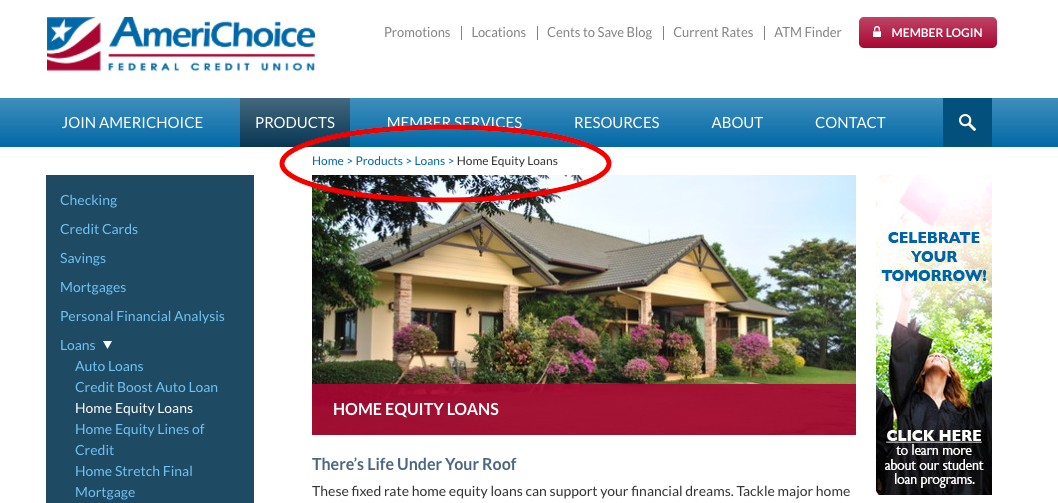
- There are bread crumbs at the top of the page’s content showing each of the following pages that led to this page. You can click on any of these breadcrumbs to go back to a previous page.

As you can see, this webpage has all the components of intuitive navigation, including breadcrumbs.
6. Minimize Drop-Down Menus.
Drop-down menus can be difficult to navigate. If you’ve already decided to click on a menu item, and then see multiple other options – it can cause hesitation. It also prevents users from going to your highest-value pages first. Drop-down menus also cause issues for elderly or disabled users who cannot perform finely-tuned mouse movements. If your drop-down menu currently only lists a few items, reconsider if it’s necessary at all.
Bad Drop-Down Example

This website has a drop-down menu with only one sub-category. This only makes the navigation more confusing for the user.
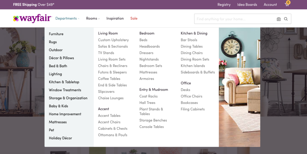
One major exception to this rule is the mega menu. These drop-down menus can improve user experience if you have a large number of categories and products on your site. This is best illustrated by large e-commerce retailers like Wayfair or Amazon. Without large drop-down menus, it would be difficult for a user to find the specific product category they were looking for without using the search bar.
Mega-Menu Example

Wayfair has an enormous number of products on their site. Creating a mega-menu with additional sub-categories helps users navigate to the specific type of furniture they may be searching for.
7. Try Recirculating Traffic.
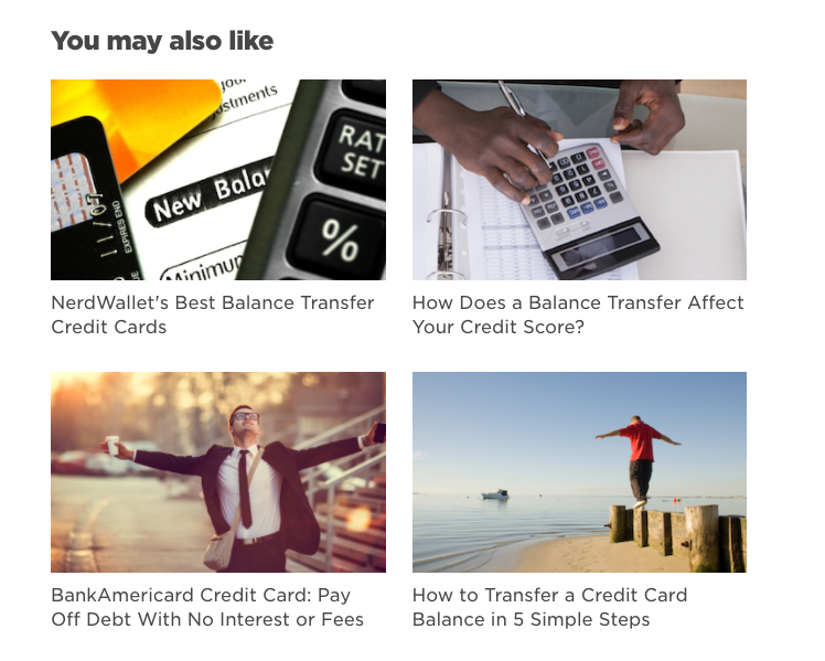
This technique is best used on a content or article-heavy site. Instead of navigating through the traditional menu, you give users the option to navigate based on related or recommended content. If they are reading an article about credit cards, you give them a short list of related articles and pages at the bottom or side of the webpage. This can keep them on your site longer as they discover additional content related to their interests.
 At the bottom of NerdWallet’s post, “How to Pick the Best Credit Card for You,” they have this section of recommended content. This related content helps readers find more relevant articles and stay on your site longer.
8. Use Text over Buttons.
Your website navigations should always utilize text links rather than graphic buttons. Google can easily crawl text to establish search rankings, but cannot read graphics. Using text will help your SEO. Plus, text formatting has improved over the years to become just as easily customizable as a graphic button.
9. Always Consider All Types of Users.
Not everyone uses a computer the same way – in fact, not everyone uses a computer. Your navigation should be intuitive not just for the standard desktop user, but also mobile users, elderly users, and disabled users. Each of these types of users have a specific set of challenges. Identify what challenges they might incur on your website’s navigation and make those challenges disappear.
Problem: Mobile users without a mouse cannot escape the hovering drop-down menu.
Solution: Have an X or close button within every drop-down menu.
Problem: A vision-impaired user has trouble distinguishing important menu items.
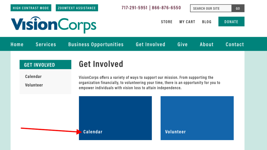
Solution: Make font larger and have increased contrast between colors to help make it easier to read.

You can see that on VisionCorps’ website, important navigation items are clearly defined with boxes and high contrast colors.
To Recap
These navigation examples and tips should help you create a website that’s not just beautiful to look at, but also simple to use. Make sure you incorporate the following best practices into your current or future website.
- Use standard menu formats.
- Put the most important items at the front and end of the menu.
- Use specific menu titles.
- Make sure your main menu has less than 7 items.
- Insert breadcrumbs and headers on all pages.
- Only use drop-down menus when necessary.
- Recirculate traffic with recommended content.
- Always use text over buttons.
- Make sure your navigation accommodates all types of users, not just a tech-savvy desktop user.

