5 Key Ways to Grow Mobile Website Traffic
| February 28, 2018 | Posted in Marketing
If you aren’t taking advantage of mobile website traffic, you’re missing out on a huge segment of the market! Today we’re breaking down how to generate mobile traffic to your website in 5 key ways.
Is your website mobile-friendly?
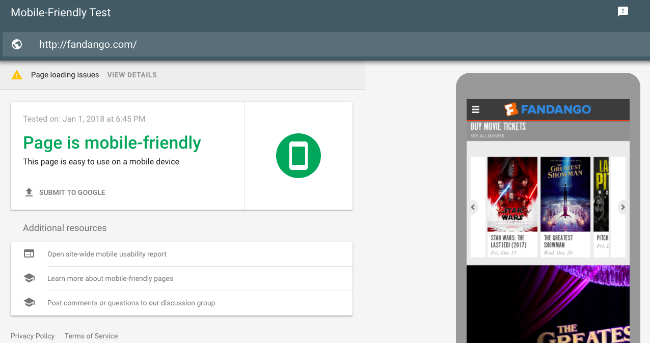
Before we start, find out if your website is already easy-to-use on mobile devices. Google has a simple mobile-friendly test that you can run on any website url for free. It lets you know if your site is mobile-friendly and gives suggestions on how to improve your site. Check out what Fandango’s test looked like.

1. Use Responsive Design
- Over 52% of website traffic is coming from mobile devices, compared to just under 44% from desktop computers. (StatCounter)
- Almost 8 out of 10 customers would simply stop engaging with content that doesn’t display well on the device of their choosing. (SWEOR)
Have you ever had to navigate a website on your phone that doesn’t automatically resize for your device? Did you have to pinch and zoom and struggle to find the information you were looking for? Chances are you are one of those 8 people above who aren’t going to use that site any more.
A responsive website adjusts its formatting and design to optimize the viewing experience no matter what device someone is using. Users can navigate the site easily no matter if they are on a desktop or a phone. Here’s an example of a non-responsive site compared to a responsive site.

This is how you’re going to take the most advantage out of any mobile traffic. A responsive website will increase organic traffic to your site, improve your mobile SEO, and help convert mobile visitors with the stream-lined design and navigation.
2. Speed Up Your Website

- 47% of visitors are expecting your site to load in less than two seconds (Source)
- A one second delay means conversions decrease by 7% and page views decrease by 11% (Source)
Mobile visitors need your website to load fast. They might be on their phone more frequently, but it’s only at shorter intervals. They may only have a minute while standing in line to find the information they need. If your site doesn’t load fast enough – they’re on to a different site. And it’s unlikely that they’ll ever try to go back to your site again.
Speed not only affects user experience, but it can also affect your Google search rankings. Google prioritizes websites who have faster loading times. Find out the 9 Common Causes of Slow Page Load Time to identify where you might need to improve.
3. Take Advantage of your Location
- 69% of mobile users who search for a product or service expect the business they find to be within 5 miles of their current location (Google)
- 50% of mobile users have used a local search and/or map to find a business. (SocialMediaToday)
More than ever, mobile users are using their smartphones and tablets to find the product and/or service they want. They search for options closest to them, with good reviews, and easy-to-find information on the mobile website. How do you take advantage of the local mobile users in your area? The first, major step was to make your website responsive. If that’s checked off, it’s time to get yourself a local listing through Google!
Google’s business platform allows you to create a listing for each of your locations for free. Having a listing will create a better chance that the next search shows your business rather than your competitor. Just make sure that your contact information is always up to date!
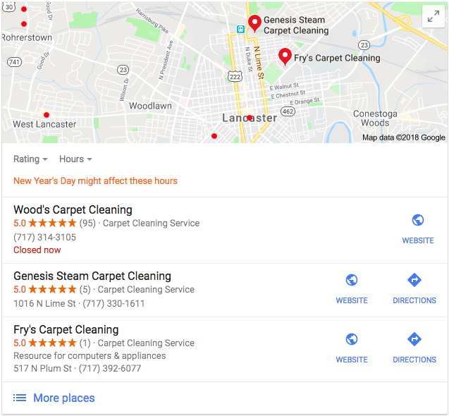
Here’s an example of a local listing that shows up when you search ‘carpet cleaner Lancaster pa.’


In addition to creating business listings directly through Google, you should also use specific keywords on your site that target location-based searches. This could be as simple as placing your city and state within these sections on the appropriate pages:
- Title tags
- H1 headings
- URLs
- Content
- Alt tags
- Meta description
4. Optimize the User Experience

- 73% of people dislike online pop-up advertisements and 70% dislike ads on their mobile phone. (Hubspot)
- 57% of people wouldn’t recommend a business if they thought the mobile site was poorly designed. (socPub)
In addition to responsive design, there are plenty of other design tricks that improve the mobile user experience. If their experience is positive, they will be more likely to follow your desired call-to-actions, revisit your site, and refer you to their social circle.
The first trick is to cut back on the text-to-image ratio. Since most mobile visitors aren’t planning on doing a deep-dive into your site, give them the information they want quickly. Cut back on lengthy paragraphs and instead focus on calls-to-action and sharable imagery.
The second trick is to not annoy them with pop-up advertisements or unnecessary animations. Make your site simple, clean, and the results will follow. This could also apply to your menu format. Use a drop-down menu for mobile users so that it takes up less screen area unless they want to view it. And don’t use Flash – most users won’t have the ability to use this plugin on their mobile device.
Optimizing the mobile user experience means you have to think about navigating the site from their perspective. What layout will help them find the information they need as fast as possible? What design makes the experience easier rather than annoying? Are you designing for someone using their finger to navigate the site rather than a mouse? You can always use testing tools to get real data. This data can inform how you design your site in the future.
5. Budget for Mobile Advertising

- 57% of mobile users planned to use a mobile coupon in 2017 (eMarketer).
- 92% of mobile video viewers share mobile video content with their network (eMarketer).
Once you have a fully optimized website for mobile users, a smart way to increase traffic and conversions is to invest in mobile advertising. You need to reach prospective customers where they are spending the most time. Mobile usage is only going to rise in the future, so it’s smart to find a way to reach them there. Here are a few examples of mobile advertising:
- Text ads through sms
- Banner advertisements on mobile websites
- Pay-per-click search advertising
- In-app advertising
- Social media sponsored posts and native ads
It could be a simple display graphic, or a video that plays in an Instagram feed. The possibilities are endless. The most important tip to remember is that even if you are successful in driving clicks and traffic to your website, if your website isn’t optimized for mobile users – they won’t convert. Focus on creating the best user experience possible before spending too much money on mobile advertising.
5 Key Strategies for Mobile Growth

Each of the strategies used together can help drive more mobile traffic to your website and convert customers while there. Make sure you –
- Implement responsive design into your website.
- Make your website speed as fast as possible.
- Take advantage of local mobile users.
- Optimize your design and navigation with mobile users in mind.
- Start using mobile advertising campaigns.
Are there any strategies we missed or that you’ve had success with? Let us know in the comments!

